
Advisor Dashboard
Enterprise / Oct 2020 - Apr 2022
Company
FactSet
Status
Launched
Additional team members include a visual designer, user researcher, two product managers and three engineers.
Background
Context and Opportunity
Disconnected workflow
Wealth advisors need to synthesize data across multiple disconnected platforms to effectively support their clients.
How might we centralize the wealth advisor's data needs so that they can seamlessly perform their work tasks?
My team was asked to create an all-in-one data solution for a major financial institution's wealth advisory division, with a potential multi-million dollar sales opportunity on the line. For the MVP success was defined by getting that major sale.
Understanding wealth advisors
The team's user researcher interviewed wealth advisors that worked for the client and got a sense for their daily work, motivations, and pain points. Two common themes stood out in the interviews:
Client meetings
In-person and phone meetings with clients make up the majority of a workday.
Advisors need to answer on-the-fly questions about a client's investment performance.
During a meeting, an advisor may only have a phone or tablet at their disposal.
Investment analysis
In order to create investment strategies, advisors will dive deep into securities data.
Advisors need to keep extremely up to date on market news.
Detailed analytical work requires large data tables and integration with Microsoft Excel, typically done on a work computer.
Product Recommendations and Opportunities
Based on the research outlined above, a few product recommendations were made:
All data should default to being grouped by client and/or household to align with our user's client-centric workflow.
A quick search across all data types is vital for answering questions on the fly.
Broader context should be provided when appropriate - think news, research, and corporate events. This helps advisors get the whole picture of what is happening with investments.
The process
Forming the concept
Information architecture
Visualization of data hierarchy
A wealth advisor's entire book of business is comprised of households (also confusingly called books). Households contain clients, clients have accounts, and accounts have holdings.
The client provided a sample wealth advisor database to better visualize this hierarchy, which I utilized to form an information architecture map.
Three distinct pages merged: home dashboard, account, and holding.
Information architecture map
Low-fidelity exploration
Based on the flows outlined above, my visual design partner and I designed some low fidelity wireframes might navigate through the large amount of data provided by the system. We then got quick feedback from a handful wealth advisors at the client.
As the team progressed through the design process and built out more screens, we sought and incorporated feedback from our potential users and in-house advisory experts. We built a number of new elements based on feedback from users, including:
A book of business overview on the homepage serves as a launching point to dive deeper into specific clients.
Search on small screens is essential for quick access to client profiles.
Combine news and research into one section - users saw them as part of the same general task.

Rounds of low-fi concepts with feedback from client
End design
Product walkthrough
A comprehensive desktop platform
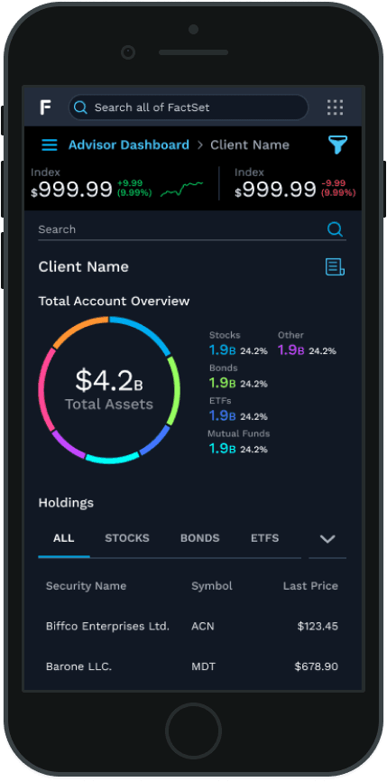
The final design has three main screens: a home screen with data on an advisor's book of business, a client profile, and an individual holding breakdown.
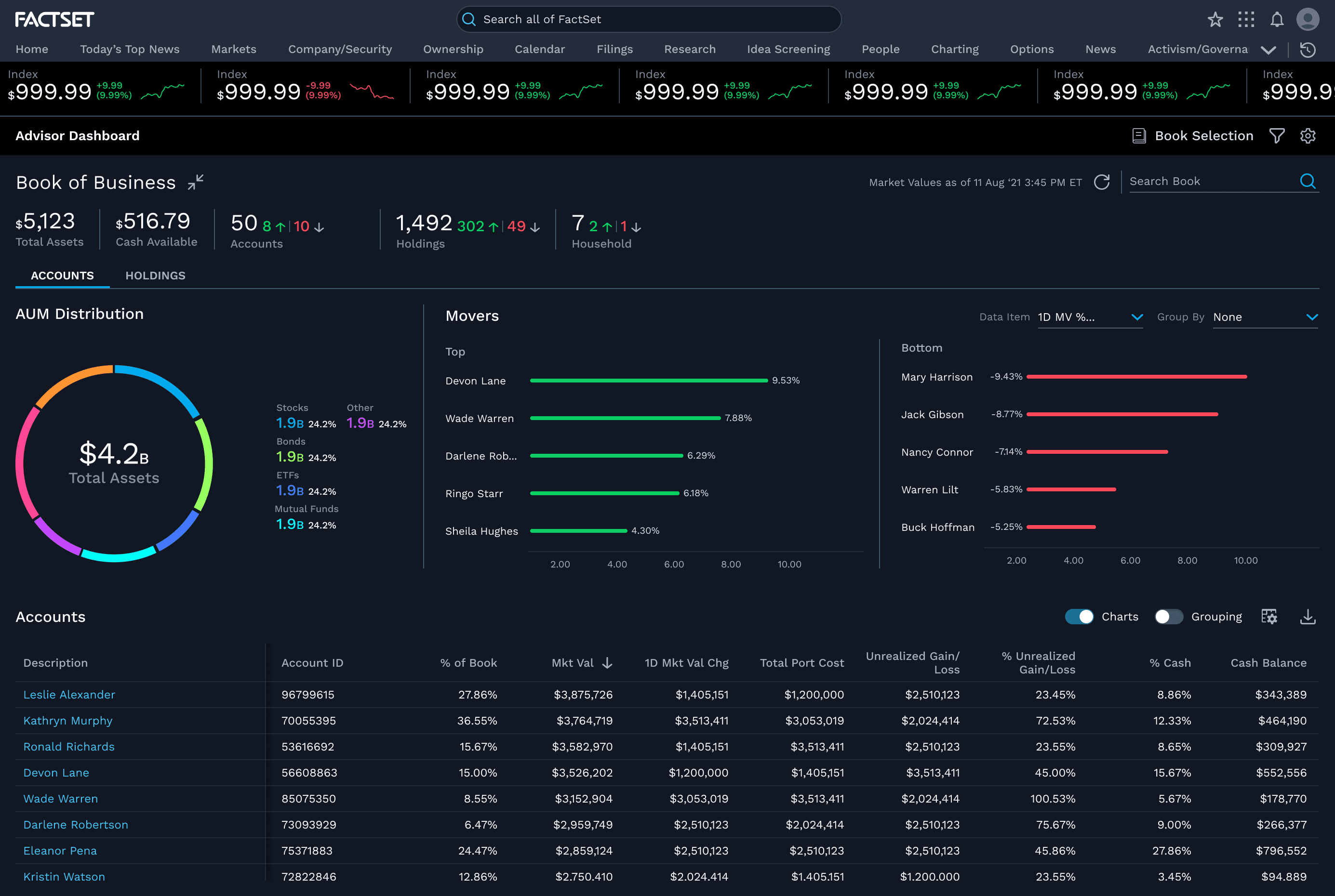
Home Dashboard

Account Page

Holding Page
A focused mobile experience
The mobile experience of this application is a pared down version of the desktop site. Our research indicated that on-the-go advisors do not need detailed data reports. Instead, they need to monitor their book of business and quickly pull up a client account for in-person meetings.
The mobile experience favors displaying data visualizations rather than large data tables, and prioritizes the cross-app search for quick access to a client's profile.
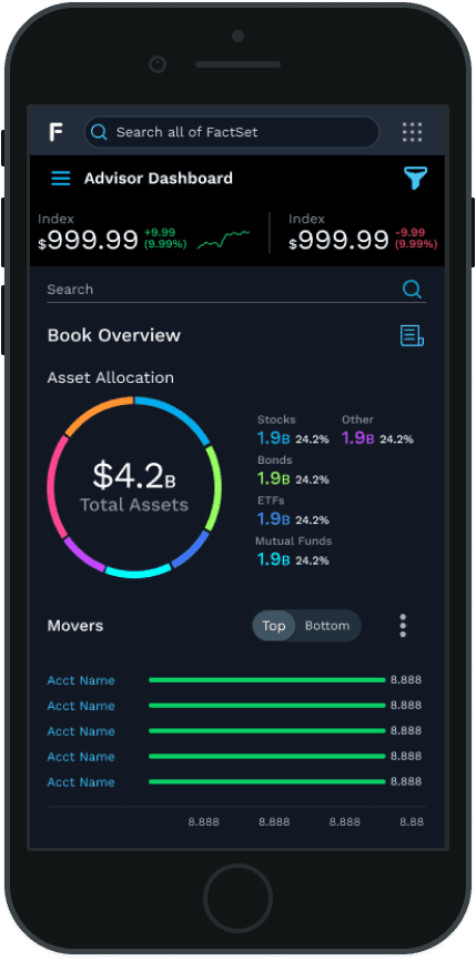
Mobile-sized Home and Account screens
Customizable data
In order to create a one-size-fits-all platform, we needed to allow users to customize their data and display. I wound up designing 4 individual panels for:
Book selection to narrow down which households populate the platform.
Book filters to further refine which accounts are shown from the selected books.
Data settings to define which market sources to pull from, and how the data is formatted.
Grid display settings to customize which fields are shown, as well as sorting and grouping features.

Book selection

Book filters

Data settings

grid display settings
Adding value through data integration
Since FactSet's main product (that the client already subscribed to) is a large financial data platform, we were able to layer our insights with their book of business dataset. This ultimately solves the problem of the disconnected workflow, and keeps advisors in one place for all their data needs.
One of the first tools we delivered was a "Notifications" panel that aggregated news, research, signals and corporate events for all holdings associated with the content on the screen (i.e. book, client, etc).
an example notifications panel for a client page
Impact
Making a big splash in the market
Sales
The original goal of this project was to land a contract with a major banking firm. After a 6 month trial with the prospective client, we officially signed the firm as a client in July 2021 and went live.
By November 2021, Advisor Dashboard has grown to over 25,000 users generating $7.5 Million in new revenue.