
Loan management
Consumer / Jan - Feb 2024

Context
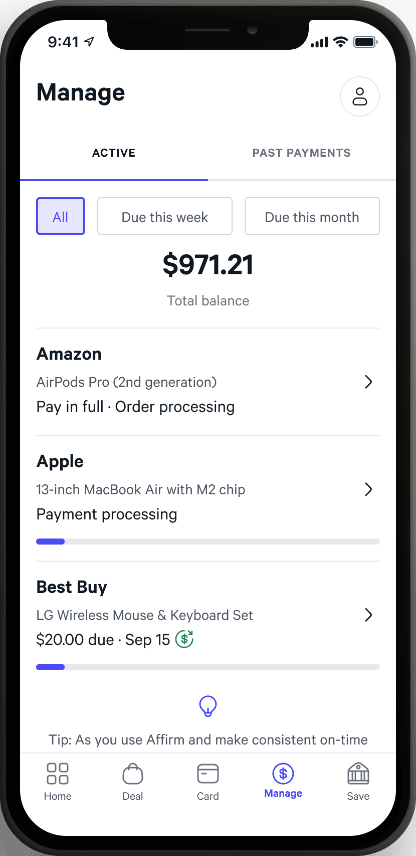
The most visited surface on Affirm's app
60% of all traffic to the Affirm app goes to the “Manage” tab, which has a database of all active & past loans. This experience had not changed materially since 2019, and internally was considered "stale."

Opportunity
Understand core user behavior
Before the team embarked on a redesign of this surface, I sought to establish a better understanding of usage through qualitative research.
Research plan
Lengthy interviews to capture experience and opinions
Methodology
Twelve moderated interviews with users focused on walking through the last time they used the app (must be within the last 2 weeks).
Research goals
01
Understand the jobs to be done when in the manage tab.
02
Understand the elements of the manage tab that are valuable to users and why.
03
Identify opportunity areas to improve the Manage tab experience.
Key findings
Why the Manage tab is used so often
User's mental model: one account with individual bills
Affirm is one payment method out of many for our users. Credit cards, bank accounts, and other BNPL platforms will also have bills to manage. Users consider their relationship with Affirm as an "account."
Each loan taken out has a unique payment schedule, and in turn users account for them individually when managing finances. Every plan is seen as its own bill much like monthly rent or utilities.


The Manage tab gives users a sense of their overall standing with Affirm, which gives them an understanding of their broader financial health.
This helps them stay on track, find opportunities to get ahead on payments, and determine if they can responsibly spend more.
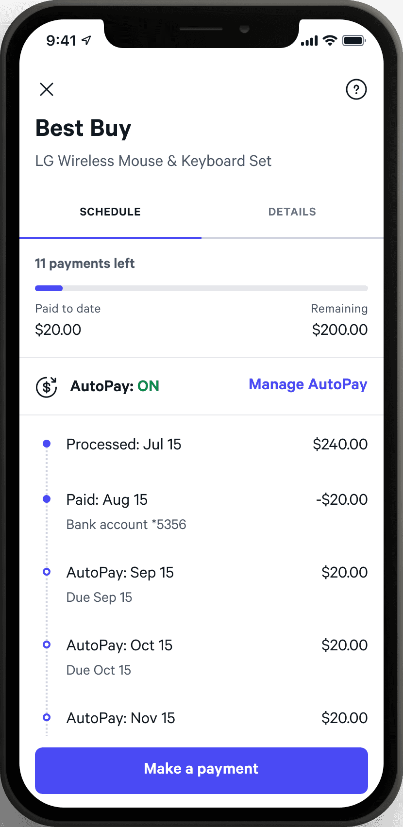
Checking recent payment status
Since a payment can take up to 5 business days to process, users often want to check on the payment status. They may just want to ensure that everything is working, or they're actively managing the cash flow from their accounts and timing is everything.
Actionable learnings
How can we apply this?
Maintain hierarchy of information
The information architecture of the Manage experience is one that users really appreciate since it mirrors their mental model - one account with individual bills.
Improve communication of payment status
Users are anxious to see if and when their payments go through. A change in payment status should be notified in a timely and effective manner. Additionally, that information should be front-and-center in the Manage experience. I hypothesize that this would both reduce user anxiety and increase the on time payment rate.